The Perception of Stress in Graph Drawings

0
Sign in to get full access
Overview
- The paper explores how people perceive the "stress" of graph drawings - the tension or distortion in the layout.
- Researchers conducted experiments to understand what visual features contribute to the perceived stress of graph drawings.
- The findings provide insights into how to design graph visualizations that are more intuitive and aesthetically pleasing to users.
Plain English Explanation
Graphs are visual representations of data, with nodes (points) connected by edges (lines). When graphs are drawn, the placement of the nodes and edges can create a feeling of "stress" or tension in the layout. This stress can make the graph harder to understand and less aesthetically pleasing.
The researchers in this paper wanted to understand what visual features contribute to the perception of stress in graph drawings. They conducted experiments where people viewed different graph layouts and rated how "stressed" each one looked. By analyzing the results, the researchers identified key factors that influence the perceived stress, such as:
- The distribution of edge lengths - Graphs with more uniform edge lengths tend to look less stressed.
- The symmetry and regularity of the layout - Graphs with more symmetrical and regular patterns appear less stressed.
- The presence of well-defined clusters - Graphs where nodes naturally group together into clusters look less stressed.
These insights can help graph visualization designers create layouts that are more intuitive and aesthetically pleasing for users. By understanding the visual features that contribute to perceived stress, they can adjust the layout algorithms to produce graphs that feel more balanced and natural.
Technical Explanation
The paper reports on a series of experiments that investigated how people perceive the "stress" or tension in graph drawings. The researchers used two main approaches:
-
User Studies: They conducted online experiments where participants viewed various graph layouts and rated the perceived stress of each one on a scale. By analyzing the ratings, the researchers identified several visual features that influence stress perception, such as:
- Edge length distribution: Graphs with more uniform edge lengths were rated as less stressed.
- Symmetry and regularity: Layouts with higher degrees of symmetry and regularity were perceived as less stressed.
- Cluster structure: Graphs where nodes formed well-defined clusters were rated as less stressed.
-
Computational Modeling: The researchers also developed a computational model to predict the perceived stress of graph layouts. This model takes into account various visual features, such as edge lengths, angular resolution, and cluster structure, to estimate the stress level. They found that this model's predictions correlated well with the human ratings from the user studies.
By understanding the visual factors that contribute to the perception of stress in graph drawings, the researchers provide insights that can inform the design of more intuitive and aesthetically pleasing graph visualizations. These findings could be useful for developers of graph drawing algorithms and visualization tools.
Critical Analysis
The paper provides a thorough and well-designed investigation into the perception of stress in graph drawings. The user studies were carefully conducted, and the computational model demonstrates a promising approach to quantifying and predicting this perception.
One potential limitation is that the experiments were focused on relatively simple, abstract graph layouts. It would be interesting to see how the findings translate to more complex, real-world graph data and visualizations. Additionally, the paper does not explore the potential cultural or individual differences in the perception of stress, which could be an interesting avenue for future research.
Furthermore, the paper does not delve deeply into the cognitive and perceptual mechanisms underlying the observed effects. Understanding the underlying psychological processes could lead to even more robust and generalizable insights for graph visualization design.
Despite these minor limitations, the paper makes a valuable contribution to the field of graph visualization and information visualization in general. The insights provided can help designers create more intuitive and aesthetically pleasing graph layouts, ultimately improving the user experience and the effectiveness of data exploration and analysis.
Conclusion
This paper provides important insights into the perception of stress in graph drawings. Through a series of user studies and computational modeling, the researchers identified key visual features that contribute to the perceived stress of graph layouts, such as edge length distribution, symmetry, and cluster structure.
These findings can inform the design of graph visualization tools and algorithms, enabling the creation of more intuitive and aesthetically pleasing graph representations. By understanding the visual factors that influence stress perception, designers can optimize graph layouts to support better data exploration, analysis, and communication.
The research reported in this paper represents a valuable contribution to the field of information visualization, with potential applications in a wide range of domains that rely on graph-based data representations, such as social network analysis, biological network visualization, and knowledge graph exploration.
This summary was produced with help from an AI and may contain inaccuracies - check out the links to read the original source documents!
Related Papers
0
The Perception of Stress in Graph Drawings
Gavin J. Mooney, Helen C. Purchase, Michael Wybrow, Stephen G. Kobourov, Jacob Miller
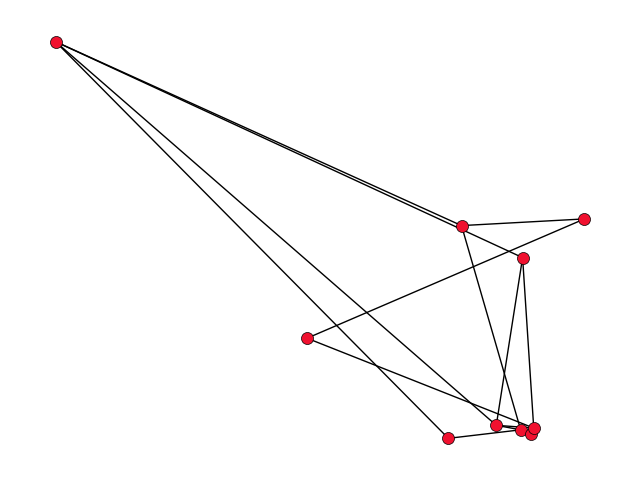
Most of the common graph layout principles (a.k.a. aesthetics) on which many graph drawing algorithms are based are easy to define and to perceive. For example, the number of pairs of edges that cross each other, how symmetric a drawing looks, the aspect ratio of the bounding box, or the angular resolution at the nodes. The extent to which a graph drawing conforms to these principles can be determined by looking at how it is drawn -- that is, by looking at the marks on the page -- without consideration for the underlying structure of the graph. A key layout principle is that of optimising `stress', the basis for many algorithms such as the popular Kamada & Kawai algorithm and several force-directed algorithms. The stress of a graph drawing is, loosely speaking, the extent to which the geometric distance between each pair of nodes is proportional to the shortest path between them -- over the whole graph drawing. The definition of stress therefore relies on the underlying structure of the graph (the `paths') in a way that other layout principles do not, making stress difficult to describe to novices unfamiliar with graph drawing principles, and, we believe, difficult to perceive. We conducted an experiment to see whether people (novices as well as experts) can see stress in graph drawings, and found that it is possible to train novices to `see' stress -- even if their perception strategies are not based on the definitional concepts.
Read more9/24/2024
0
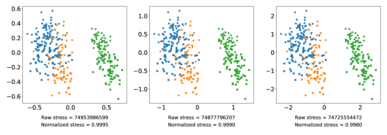
Normalized Stress is Not Normalized: How to Interpret Stress Correctly
Kiran Smelser, Jacob Miller, Stephen Kobourov
Stress is among the most commonly employed quality metrics and optimization criteria for dimension reduction projections of high dimensional data. Complex, high dimensional data is ubiquitous across many scientific disciplines, including machine learning, biology, and the social sciences. One of the primary methods of visualizing these datasets is with two dimensional scatter plots that visually capture some properties of the data. Because visually determining the accuracy of these plots is challenging, researchers often use quality metrics to measure projection accuracy or faithfulness to the full data. One of the most commonly employed metrics, normalized stress, is sensitive to uniform scaling of the projection, despite this act not meaningfully changing anything about the projection. We investigate the effect of scaling on stress and other distance based quality metrics analytically and empirically by showing just how much the values change and how this affects dimension reduction technique evaluations. We introduce a simple technique to make normalized stress scale invariant and show that it accurately captures expected behavior on a small benchmark.
Read more8/16/2024
0
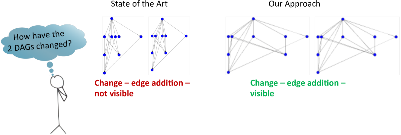
A Shape Change Enhancing Hierarchical Layout for the Pairwise Comparison of Directed Acyclic Graphs
Kathrin Guckes (n'ee Ballweg), Marc Schapers, Prof. Margit Pohl, Prof. Andreas Kerren, Prof. Tatiana von Landesberger
Comparing directed acyclic graphs is essential in various fields such as healthcare, social media, finance, biology, and marketing. DAGs often result from contagion processes over networks, including information spreading, retweet activity, disease transmission, financial crisis propagation, malware spread, and gene mutations. For instance, in disease spreading, an infected patient can transmit the disease to contacts, making it crucial to analyze and predict scenarios. Similarly, in finance, understanding the effects of saving or not saving specific banks during a crisis is vital. Experts often need to identify small differences between DAGs, such as changes in a few nodes or edges. Even the presence or absence of a single edge can be significant. Visualization plays a crucial role in facilitating these comparisons. However, standard hierarchical layout algorithms struggle to visualize subtle changes effectively. The typical hierarchical layout, with the root on top, is preferred due to its performance in comparison to other layouts. Nevertheless, these standard algorithms prioritize single-graph aesthetics over comparison suitability, making it challenging for users to spot changes. To address this issue, we propose a layout that enhances shape changes in DAGs while minimizing the impact on aesthetics. Our approach involves outwardly swapping changes, altering the DAG's shape. We introduce new drawing criteria. Our layout builds upon a Sugiyama-like hierarchical layout and implements these criteria through two extensions. We designed it this way to maintain interchangeability and accommodate future optimizations, such as pseudo-nodes for edge crossing minimization. In our evaluations, our layout achieves excellent results, with edge crossing aesthetics averaging around 0.8 (on a scale of 0 to 1). Additionally, our layout outperforms the base implementation by an average of 60-75%.
Read more6/11/2024
