Does This Have a Particular Meaning? Interactive Pattern Explanation for Network Visualizations

0
Sign in to get full access
Overview
- This paper presents an interactive system that helps users understand the meaning and significance of patterns in network visualizations.
- The system allows users to explore and investigate network data interactively, with explanations provided to help them interpret the visualizations.
- The authors focus on making network analysis more accessible and understandable for non-expert users.
Plain English Explanation
Network data, which captures the connections between different entities, can be very complex and difficult for non-experts to interpret. The authors of this paper recognized this challenge and developed an interactive system to help users make sense of network visualizations.
The key idea is to allow users to explore the network data interactively, and provide explanations to help them understand what they are seeing. For example, if the user hovers over a group of nodes in the visualization, the system can highlight the significance of that pattern and explain why it might be meaningful.
By making network analysis more accessible and understandable, the authors hope to increase "network literacy" - the ability of non-experts to comprehend and work with network data. This could have important implications for a wide range of applications, from social network analysis to biological network modeling.
Technical Explanation
The paper describes a system that combines interactive network visualization with automated pattern detection and explanation. The system allows users to explore a network dataset by panning, zooming, and selecting different nodes and edges.
When the user interacts with the visualization, the system analyzes the network structure and identifies potentially meaningful patterns, such as clusters or bridges between communities. It then generates explanations for these patterns, which are presented to the user in an intuitive way.
The explanations are generated using a combination of network analysis techniques and natural language generation. For example, the system might explain that "this cluster of nodes represents a closely connected group of people who share many common interests."
The authors conducted a user study to evaluate the effectiveness of their system, and found that it helped non-expert users gain a better understanding of the network data and the insights it contained.
Critical Analysis
The paper presents a promising approach to making network analysis more accessible and understandable for non-expert users. The interactive system and automated explanation generation could be valuable in a wide range of applications, from social network analysis to biology.
However, the authors acknowledge some limitations of their work. For example, the explanations generated by the system may not always be accurate or complete, and the user study was relatively small in scale.
Additionally, the paper does not address the potential for misuse or misinterpretation of the system's outputs. There is a risk that users could rely too heavily on the automated explanations without critically evaluating them, or that the system could reinforce existing biases or misconceptions about network data.
Further research and testing would be needed to fully understand the strengths and limitations of this approach, and to explore ways of mitigating potential risks or drawbacks.
Conclusion
This paper presents an innovative approach to making network analysis more accessible and understandable for non-expert users. By combining interactive visualization with automated pattern detection and explanation, the authors have developed a system that could significantly increase "network literacy" and enable a wider range of people to derive insights from network data.
While the system has some limitations and potential risks that require further exploration, the core idea of using interactive explanations to bridge the gap between data and understanding is a valuable contribution to the field of network analysis. As the importance of network data continues to grow across many domains, tools like this could play an important role in democratizing access to these powerful insights.
This summary was produced with help from an AI and may contain inaccuracies - check out the links to read the original source documents!
Related Papers
0
Does This Have a Particular Meaning? Interactive Pattern Explanation for Network Visualizations
Xinhuan Shu, Alexis Pister, Junxiu Tang, Fanny Chevalier, Benjamin Bach
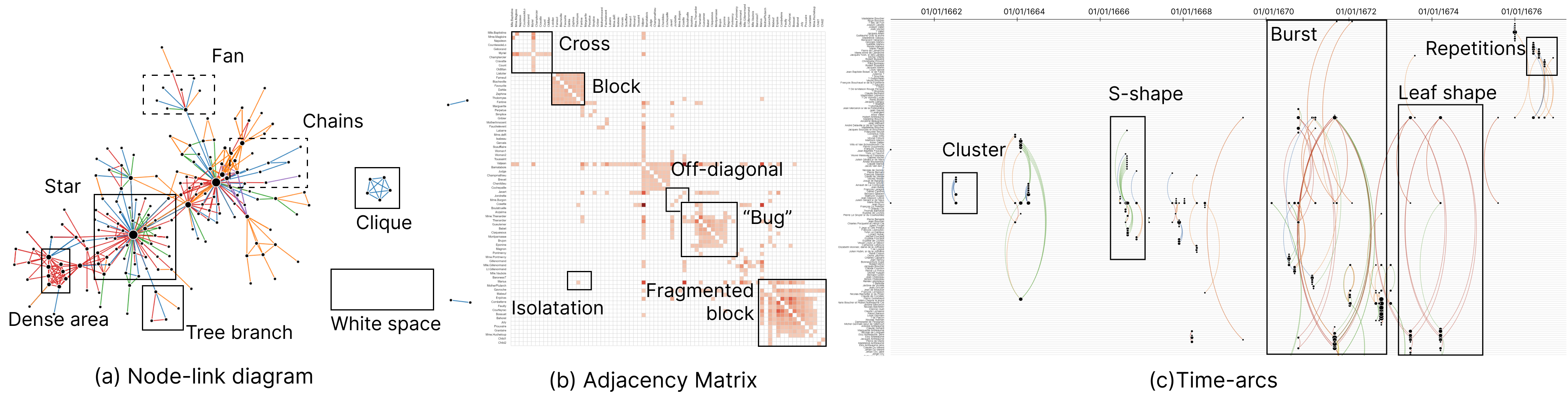
This paper presents an interactive technique to explain visual patterns in network visualizations to analysts who do not understand these visualizations and who are learning to read them. Learning a visualization requires mastering its visual grammar and decoding information presented through visual marks, graphical encodings, and spatial configurations. To help people learn network visualization designs and extract meaningful information, we introduce the concept of interactive pattern explanation that allows viewers to select an arbitrary area in a visualization, then automatically mines the underlying data patterns, and explains both visual and data patterns present in the viewer's selection. In a qualitative and a quantitative user study with a total of 32 participants, we compare interactive pattern explanations to textual-only and visual-only (cheatsheets) explanations. Our results show that interactive explanations increase learning of i) unfamiliar visualizations, ii) patterns in network science, and iii) the respective network terminology.
Read more8/6/2024

0
Interactive Explanation of Visual Patterns in Dimensionality Reductions with Predicate Logic
Brian Montambault, Gabriel Appleby, Jen Rogers, Camelia D. Brumar, Mingwei Li, Remco Chang
Dimensionality reduction techniques are widely used for visualizing high-dimensional data. However, support for interpreting patterns of dimension reduction results in the context of the original data space is often insufficient. Consequently, users may struggle to extract insights from the projections. In this paper, we introduce DimBridge, a visual analytics tool that allows users to interact with visual patterns in a projection and retrieve corresponding data patterns. DimBridge supports several interactions, allowing users to perform various analyses, from contrasting multiple clusters to explaining complex latent structures. Leveraging first-order predicate logic, DimBridge identifies subspaces in the original dimensions relevant to a queried pattern and provides an interface for users to visualize and interact with them. We demonstrate how DimBridge can help users overcome the challenges associated with interpreting visual patterns in projections.
Read more4/15/2024

0
Interpretable Network Visualizations: A Human-in-the-Loop Approach for Post-hoc Explainability of CNN-based Image Classification
Matteo Bianchi, Antonio De Santis, Andrea Tocchetti, Marco Brambilla
Transparency and explainability in image classification are essential for establishing trust in machine learning models and detecting biases and errors. State-of-the-art explainability methods generate saliency maps to show where a specific class is identified, without providing a detailed explanation of the model's decision process. Striving to address such a need, we introduce a post-hoc method that explains the entire feature extraction process of a Convolutional Neural Network. These explanations include a layer-wise representation of the features the model extracts from the input. Such features are represented as saliency maps generated by clustering and merging similar feature maps, to which we associate a weight derived by generalizing Grad-CAM for the proposed methodology. To further enhance these explanations, we include a set of textual labels collected through a gamified crowdsourcing activity and processed using NLP techniques and Sentence-BERT. Finally, we show an approach to generate global explanations by aggregating labels across multiple images.
Read more5/7/2024
📈
0
Interactive dense pixel visualizations for time series and model attribution explanations
Udo Schlegel, Daniel A. Keim
The field of Explainable Artificial Intelligence (XAI) for Deep Neural Network models has developed significantly, offering numerous techniques to extract explanations from models. However, evaluating explanations is often not trivial, and differences in applied metrics can be subtle, especially with non-intelligible data. Thus, there is a need for visualizations tailored to explore explanations for domains with such data, e.g., time series. We propose DAVOTS, an interactive visual analytics approach to explore raw time series data, activations of neural networks, and attributions in a dense-pixel visualization to gain insights into the data, models' decisions, and explanations. To further support users in exploring large datasets, we apply clustering approaches to the visualized data domains to highlight groups and present ordering strategies for individual and combined data exploration to facilitate finding patterns. We visualize a CNN trained on the FordA dataset to demonstrate the approach.
Read more8/28/2024