Science in a Blink: Supporting Ensemble Perception in Scalar Fields

0

Sign in to get full access
Overview
- This paper explores ways to support "ensemble perception" in visualizing scalar fields, which involves perceiving general patterns and trends in data at a glance rather than focusing on individual data points.
- The researchers propose several techniques, including integrating animated transitions, using color blending, and leveraging perceptual organization, to enhance ensemble perception in scalar field visualizations.
- Through user studies, the paper evaluates the effectiveness of these approaches and provides design guidelines for creating scalar field visualizations that better support ensemble perception.
Plain English Explanation
The paper focuses on making it easier for people to quickly understand the overall patterns and trends in complex data, rather than getting bogged down in the details of individual data points. This is known as "ensemble perception" - the ability to perceive the big picture at a glance.
The researchers looked at visualizing scalar fields, which are a type of data that has values associated with different locations. For example, a scalar field could represent temperature measurements across a geographical area.
To support ensemble perception in these types of visualizations, the researchers experimented with a few different techniques:
- Animated transitions: Adding smooth animations when the visualization changes, to help the viewer track how the overall patterns are shifting.
- Color blending: Using color blending to merge individual data points into a cohesive visual texture, rather than showing each point discretely.
- Perceptual organization: Leveraging principles of human visual perception, like grouping and symmetry, to make the overall patterns more salient.
The team then conducted user studies to see how well these techniques worked compared to more traditional visualization approaches. Based on the results, they provide guidelines for designing scalar field visualizations that effectively support ensemble perception.
The goal is to help people rapidly understand the key insights in complex datasets, without getting bogged down in the nitty-gritty details. This could be especially useful in fields like weather forecasting, medical imaging, and scientific data analysis, where quickly grasping the big picture is crucial.
Technical Explanation
The paper explores techniques to enhance "ensemble perception" in scalar field visualizations. Ensemble perception refers to the ability to perceive overall trends and patterns in data at a glance, rather than focusing on individual data points.
The researchers propose several approaches to support ensemble perception in scalar field visualizations:
-
Animated Transitions: They integrate animated transitions when the visualization changes, to help the viewer track how the overall patterns are shifting over time. This builds on prior work on using animation in visualizations.
-
Color Blending: They experiment with using color blending techniques to merge individual data points into a cohesive visual texture, rather than displaying each point discretely. This aims to encourage ensemble perception by making the overall patterns more salient.
-
Perceptual Organization: The researchers leverage principles of human visual perception, such as grouping and symmetry, to organize the visual elements in ways that enhance the salience of the overall patterns. This builds on research on measuring cluster pattern complexity and universal visual scaling laws.
The paper evaluates these techniques through a series of user studies, comparing them to more traditional scalar field visualization approaches. Based on the results, the researchers provide design guidelines for creating scalar field visualizations that effectively support ensemble perception.
Critical Analysis
The paper presents a well-designed study that rigorously evaluates several promising techniques for enhancing ensemble perception in scalar field visualizations. The researchers acknowledge some limitations, such as the need to further investigate how the proposed techniques scale to large or complex datasets.
One potential concern is the reliance on user studies, which can be influenced by factors like participant familiarity and individual differences in visual perception. It would be valuable to supplement these studies with more objective measures, such as computational analyses of the visual salience or information content of the different visualization techniques.
Additionally, the paper focuses primarily on 2D scalar field visualizations. It could be interesting to explore how these ensemble perception techniques might translate to 3D or higher-dimensional data representations, which could offer additional challenges and opportunities.
Overall, this paper makes a valuable contribution by exploring innovative ways to support the human ability to rapidly extract insights from complex data. The design guidelines provided could inform the development of more effective data visualization tools across a range of scientific and professional domains.
Conclusion
This paper introduces several techniques to enhance "ensemble perception" in scalar field visualizations, enabling users to quickly grasp overall trends and patterns in complex data. Through user studies, the researchers demonstrate the effectiveness of approaches like animated transitions, color blending, and perceptual organization in supporting this high-level understanding.
The findings and design guidelines from this work could have significant implications for data visualization in fields such as weather forecasting, medical imaging, and scientific research, where rapidly extracting key insights from large datasets is crucial. By empowering users to perceive the big picture at a glance, these techniques have the potential to streamline data analysis, facilitate decision-making, and accelerate scientific discovery.
As data visualization continues to evolve, this paper highlights the importance of considering human perceptual and cognitive capabilities in the design of visualization tools. By leveraging established principles of ensemble perception, the researchers have demonstrated a promising path forward for creating more effective and intuitive data representations.
This summary was produced with help from an AI and may contain inaccuracies - check out the links to read the original source documents!
Related Papers
0
Science in a Blink: Supporting Ensemble Perception in Scalar Fields
Victor A. Mateevitsi, Michael E. Papka, Khairi Reda
Visualizations support rapid analysis of scientific datasets, allowing viewers to glean aggregate information (e.g., the mean) within split-seconds. While prior research has explored this ability in conventional charts, it is unclear if spatial visualizations used by computational scientists afford a similar ensemble perception capacity. We investigate people's ability to estimate two summary statistics, mean and variance, from pseudocolor scalar fields. In a crowdsourced experiment, we find that participants can reliably characterize both statistics, although variance discrimination requires a much stronger signal. Multi-hue and diverging colormaps outperformed monochromatic, luminance ramps in aiding this extraction. Analysis of qualitative responses suggests that participants often estimate the distribution of hotspots and valleys as visual proxies for data statistics. These findings suggest that people's summary interpretation of spatial datasets is likely driven by the appearance of discrete color segments, rather than assessments of overall luminance. Implicit color segmentation in quantitative displays could thus prove more useful than previously assumed by facilitating quick, gist-level judgments about color-coded visualizations.
Read more6/21/2024
👁️
0
Revisiting Categorical Color Perception in Scatterplots: Sequential, Diverging, and Categorical Palettes
Chin Tseng, Arran Zeyu Wang, Ghulam Jilani Quadri, Danielle Albers Szafir
Existing guidelines for categorical color selection are heuristic, often grounded in intuition rather than empirical studies of readers' abilities. While design conventions recommend palettes maximize hue differences, more recent exploratory findings indicate other factors, such as lightness, may play a role in effective categorical palette design. We conducted a crowdsourced experiment on mean value judgments in multi-class scatterplots using five color palette families--single-hue sequential, multi-hue sequential, perceptually-uniform multi-hue sequential, diverging, and multi-hue categorical--that differ in how they manipulate hue and lightness. Participants estimated relative mean positions in scatterplots containing 2 to 10 categories using 20 colormaps. Our results confirm heuristic guidance that hue-based categorical palettes are most effective. However, they also provide additional evidence that scalable categorical encoding relies on more than hue variance.
Read more4/8/2024

0
Does empirical evidence from healthy aging studies predict a practical difference between visualizations for different age groups?
S. Shao, Y. Li, A. I. Meso, N. Holliman
When communicating critical information to decision-makers, one of the major challenges in visualization is whether the communication is affected by different perceptual or cognitive abilities, one major influencing factor is age. We review both visualization and psychophysics literature to understand where quantitative evidence exists on age differences in visual perception. Using contrast sensitivity data from the literature we show how the differences between visualizations for different age groups can be predicted using a new model of visible frequency range with age. The model assumed that at threshold values some visual data will not be visible to older people (spatial frequency > 2 and contrast <=0.01). We apply this result to a practical visualization and show an example that at higher levels of contrast, the visual signal should be perceivable by all viewers over 20. Universally usable visualization should use a contrast of 0.02 or higher and be designed to avoid spatial frequencies greater than eight cycles per degree to accommodate all ages. There remains much research to do on to translate psychophysics results to practical quantitative guidelines for visualization producers.
Read more8/1/2024
0
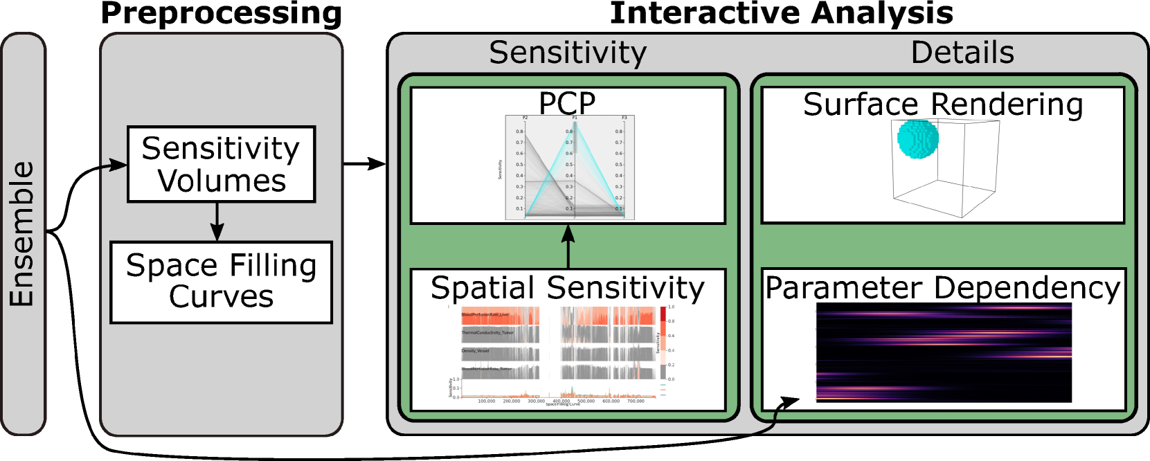
Interactive Visual Analysis of Spatial Sensitivities
Marina Evers, Simon Leistikow, Hennes Rave, Lars Linsen
Sensitivity analyses of simulation ensembles determine how simulation parameters influence the simulation's outcome. Commonly, one global numerical sensitivity value is computed per simulation parameter. However, when considering 3D spatial simulations, the analysis of localized sensitivities in different spatial regions is of importance in many applications. For analyzing the spatial variation of parameter sensitivity, one needs to compute a spatial sensitivity scalar field per simulation parameter. Given $n$ simulation parameters, we obtain multi-field data consisting of $n$ scalar fields when considering all simulation parameters. We propose an interactive visual analytics solution to analyze the multi-field sensitivity data. It supports the investigation of how strongly and in what way individual parameters influence the simulation outcome, in which spatial regions this is happening, and what the interplay of the simulation parameters is. Its central component is an overview visualization of all sensitivity fields that avoids 3D occlusions by linearizing the data using an adapted scheme of data-driven space-filling curves. The spatial sensitivity values are visualized in a combination of a Horizon Graph and a line chart. We validate our approach by applying it to synthetic and real-world ensemble data.
Read more8/9/2024